
Here at Sake Festival, we are super proud of the brand that we are building and nurturing. We are fortunate to be working with two incredible designers to help us grow our unique brand and spread our message across a broader audience.
Tokyo based Yosuke Ando was born in Japan but has actually spent more time living in Sydney Australia, which was where he met fellow designer, Kentaro Yoshida, who has been Sydney based for many years, but originally hails from Toyama, Japan.
Our curator, Simone Maynard, recently caught up with this dynamic duo to chat a little about the concept behind their design work for Sake Festival.
When Yosuke Ando was first approached to design a logo for Sake Festival, it didn’t take him long to come up with a concept that resonated with the event organisers.
At first glance, it might just come across as a modern, stylised logo using two typefaces to spell out the words ‘Sake Festival’, but look a little deeper and there are layers steeped in history and tradition that compliment this modern looking imagery.
Freelance designer Ando, who works mainly in typography and logo design, explains his use of the colour blue for the main font, ‘SAKE’, was inspired by its continued use throughout the ages in Japanese art, craft, design, and advertising.
The influence of blue in Japanese culture can be traced back to centuries-old traditions. When we look back to the stunning ukiyo-e woodblock prints, we see how blue was masterfully employed to depict serene landscapes and vibrant scenes from everyday life. The use of indigo dye in Japanese fabric design, known as ‘aizome’, also showcases the enduring popularity of the colour blue. Shibori dyeing techniques, with their intricate patterns and shades of blue, further illustrate the deep connection between the Japanese aesthetic and the hue.
Even in more recent times, we can find the presence of blue in Japanese visual culture. Consider the inside of an ochoko, the small ceramic cups used for enjoying sake. Many of these cups feature two concentric blue circular rings inside them.
The deliberate choice of blue not only reflects Ando’s artistic sensibilities but also pays homage to the enduring influence of blue in Japanese visual heritage.
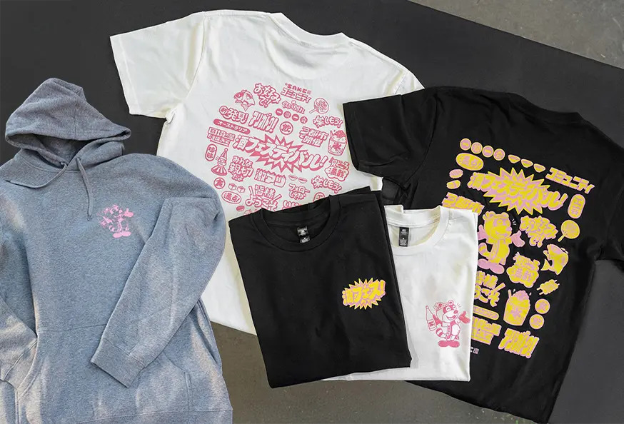
The font itself was inspired by the ancient art of calligraphy and its beautiful brush strokes. Many people will of course have seen a similar style of writing on sake labels, where the Japanese kanji characters are displayed in bold brush strokes across the front of the bottles. The typeface captures the essence of this traditional Japanese writing style, but also adds a modern twist – and we love it!
The word Festival is a little more subdued. It’s displayed in red, in a square-like design – inspired by the traditional Japanese ‘Hanko’ stamps, or personalised seals. The Hanko stamp carries a deep symbolic meaning in Japan. It represents a person’s identity and is commonly used for official purposes, such as signing contracts or legal documents. They are typically carved from wood or made from other materials like ivory or stone and incorporate a person’s name or initials. Regarded as a significant part of Japanese culture, the Hanko stamp has been a custom as far back as 57 AD!
So there you have the story behind our Sake Festival logo… but what about the quirky characters and illustrations you might have noticed popping up on our website, social media, and merchandise?
Queue Sydney-based Yoshida, who also works as a freelance designer, illustrator, and mural artist. He first met Ando when they were working at the same advertising agency in Sydney.
When approached to come on board to help build the Sake Festival brand, Yoshida jumped at the opportunity and was excited to be working alongside Ando again.
Together, the two found themselves on the same page from the beginning.
The message we wanted to deliver was centred simply around ‘fun’, but we wanted it done with style. We also wanted to embrace history and tradition, inspired greatly by the Edo period in Japan. Ando and Yoshida not only understood the vision of ‘Sake Festival’, they delivered it!
Yoshida expands on Ando’s use of blue, drawing upon influences from Ukiyo-e artists such as Hokusai, and Japan’s Edo period, bringing a playful and dynamic style to the Sake Festival branding. His illustrations feature characters inspired by Japanese customs and culture and they certainly add a sense of joy and celebration to our visual identity.
Yoshida, along with Ando, wanted to create imagery that was both fun and accessible for a broad audience, something that exuded joy and humour, but also embodied a deeper meaning and understanding of culture.
The characters and designs embrace both old and new, artfully merging ancient and modern, along with the culture of two countries: Japan and Australia.
He carefully weaves together traditional Japanese and Edo period themes and characters, adding modern elements to create a unique and engaging aesthetic. Take for example the Yakuza style, tattoo-clad cat, in one hand he holds a ceramic sake cup, and in the other, a kebab souvlaki, or the jolly Sumo wrestler, sprawled out on a beach towel. Then there’s the Kabuki performer, wearing his traditional kimono, a bottle of sake by his side, devouring an Aussie favourite – pizza. Keen observers will notice that the Sushi icon displays interpretations of the Japanese flag, and a map of Australia… or the hands, a take on shadow puppets, that are surely channelling our native Kangaroo. Every illustration has delightful layers of playfulness, connection and tradition, and has been thoughtfully crafted to engage and captivate our audience.
Yoshida’s illustrations are sure to bring a smile to your face – just like the sake will at our festival!
So there you have it – the creative minds behind our Sake Festival branding – Yosuke Ando and Kentaro Yoshida, who have brought together their unique talents, inspirations, and cultural backgrounds to create a brand that celebrates the vibrant culture and rich history of sake.
We hope you enjoy experiencing the Sake Festival brand and we look forward to what Ando and Yoshida create for us next!

Yosuke Ando
Yosuke Ando is a Tokyo based freelance graphic designer who specialises in both Latin and Japanese typographic designs.
Working closely together with Luca Ionescu at Like Minded Studio he gained a strong understanding of type design and illustration, undertaking projects that ranged from apparel, editorial, campaign based identities to corporate identities for clients such as Nike, Stussy, Zoo York, Tooheys Extra Dry and MTV. At the studio he also pro-actively undertook in-house initiatives and the self promotional piece “Do What You Like” received a Type Directors Club award in 2012. Interested in working at a large scale organisation and within the digital space, he moved to MAKE, the digital arm of the M&C Saatchi Sydney. He was responsible for the production of various digital content from online marketing content, website design, mobile apps to more experimental initiatives. Clients ranged from all business sectors including Google, Optus, Woolworths and Commonwealth Bank. Currently he works with clients such as Netflix and other global organisations to produce bespoke typographic and illustrative designs.
IG @yske_jp

Kentaro Yoshida
Kentaro was born and raised in a rural fishing village in Toyama, Japan. At the age of 18, Kentaro decided to move to Australia in pursuit of the English language, sunny beaches and a more balanced lifestyle. After a decade, he is now an illustrator and artist, and is currently based in the Northern Beaches of Sydney. Kentaro is passionate about both traditional and digital mediums. Kentaro’s pastel toned artwork has bold line-work, quirky characters, and a beach-side sense of humour.
He has worked with various international brands, as well as individuals for private commissions. Kentaro also specialises in hand-painting artwork from large-scale murals, to detailed painting on fragile watercolour paper.
Limited
Stock.
Secure your
favourite
To be notified about future Sake Festivals, please register your email address here
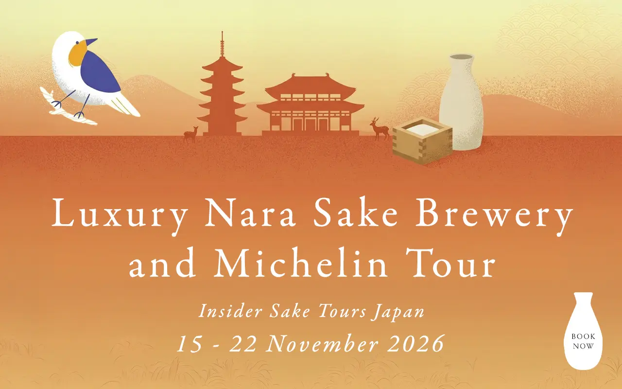
Discover the Spirit of Nara! Exclusive brewery access. Refined dining. Guided by a Sake Samurai.
SEE MORE